A closer look at the Olympic emblem for Tokyo 2020
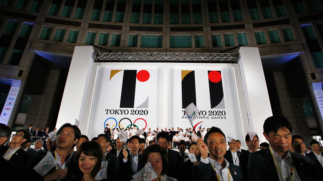
Today the Tokyo 2020 Organizing Committee dropped their Olympic emblem, which essentially becomes the ‘logo’ for the next, next summer Games.
It is a stylish ‘T’ framed by a square and containing a red circle, with the overall theme of ‘unity’. It was created by Japanese designer Kenjiro Sano.
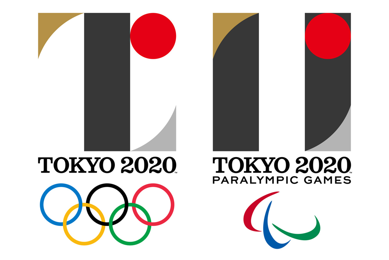
The Tokyo 2020 Olympic and Paralympic emblems.
According to a super-official explanation, the black centre column represents diversity, ‘the combination of all colours.’ Having a red circle ‘represents an inclusive world in which everyone accepts each other,’ but also seems logical since it’s part of the Japanese flag.
The ‘T’ is inspired by the words ‘Tokyo’ (obviously), ‘Tomorrow’, and ‘Team’.
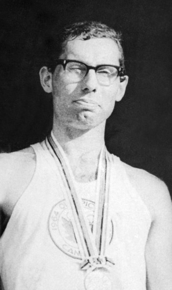
The last time Tokyo hosted an Olympic Games was 1964, and in that year they went really classic with the emblem.

Tokyo 2020 also released this video:
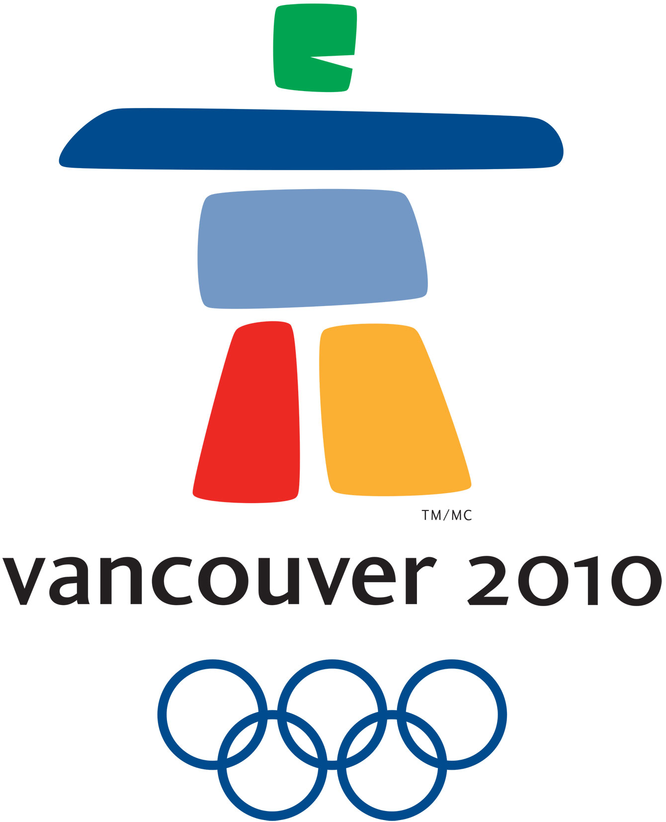
Olympic emblems have various inspirations. Vancouver 2010‘s version was chosen through local submissions and colours matched various qualities of Canada’s physical environment.
Rio 2016, the next Olympic Games, went more emotional. Essentially, the justification for an emblem’s design is pretty wide open. As long as the rings are in there, it’s all good.
![]()