Tokyo 2020 upgrades to new logos for Olympic & Paralympic Games
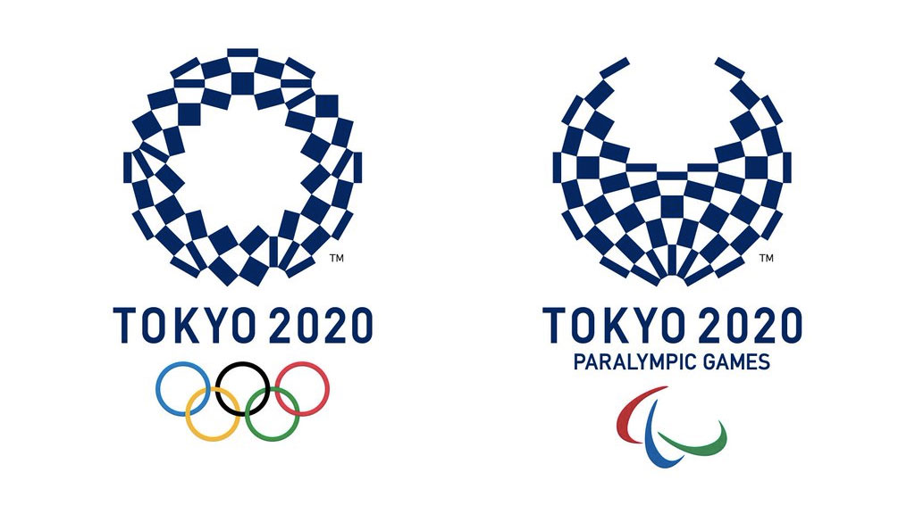
On Tuesday the Tokyo 2020 organizing committee unveiled its new Olympic emblems for the summer Games in four years.
The new logo’s stylish design created by Asao Tokolo, features a checkered ring made of a variety of blue rectangular shapes. According to the Tokyo 2020 organizing committee, the emblem incorporates the message of “Unity and Diversity” the Olympic Games promotes.
RELATED: Tokyo 2020 Heritage Zone
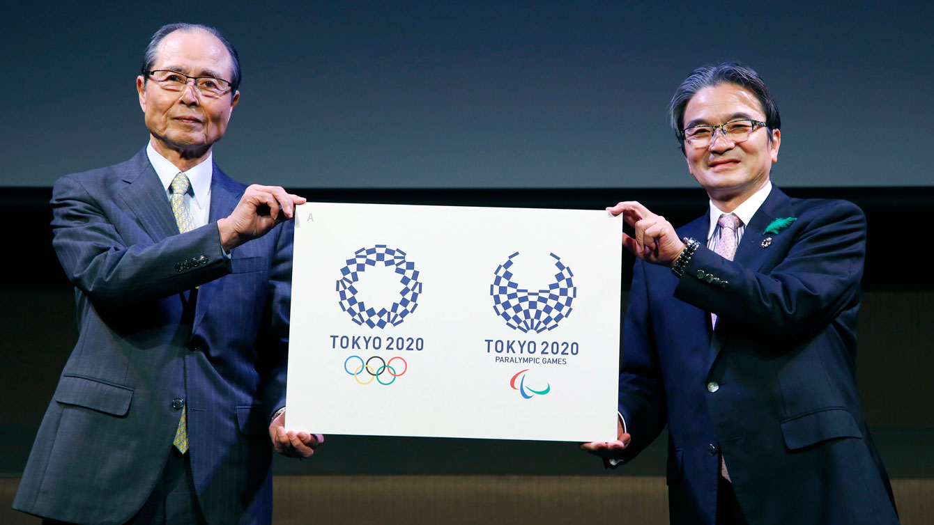
Tokyo 2020 logos for Olympic (left) and Paralympic Games revealed.
The Tokyo 2020 organizing committee explained that the indigo blue was chosen to represent the elegance and sophistication of Japan, while the variety of shapes used in the designs represents different cultures, countries and ways of thinkings.
Related: A closer look at the first emblem for Tokyo 2020
But, this wasn’t the first logo selected for Tokyo 2020, in July the Tokyo organizing committee announced its preliminary design, which was scrapped approximately a month after its release…
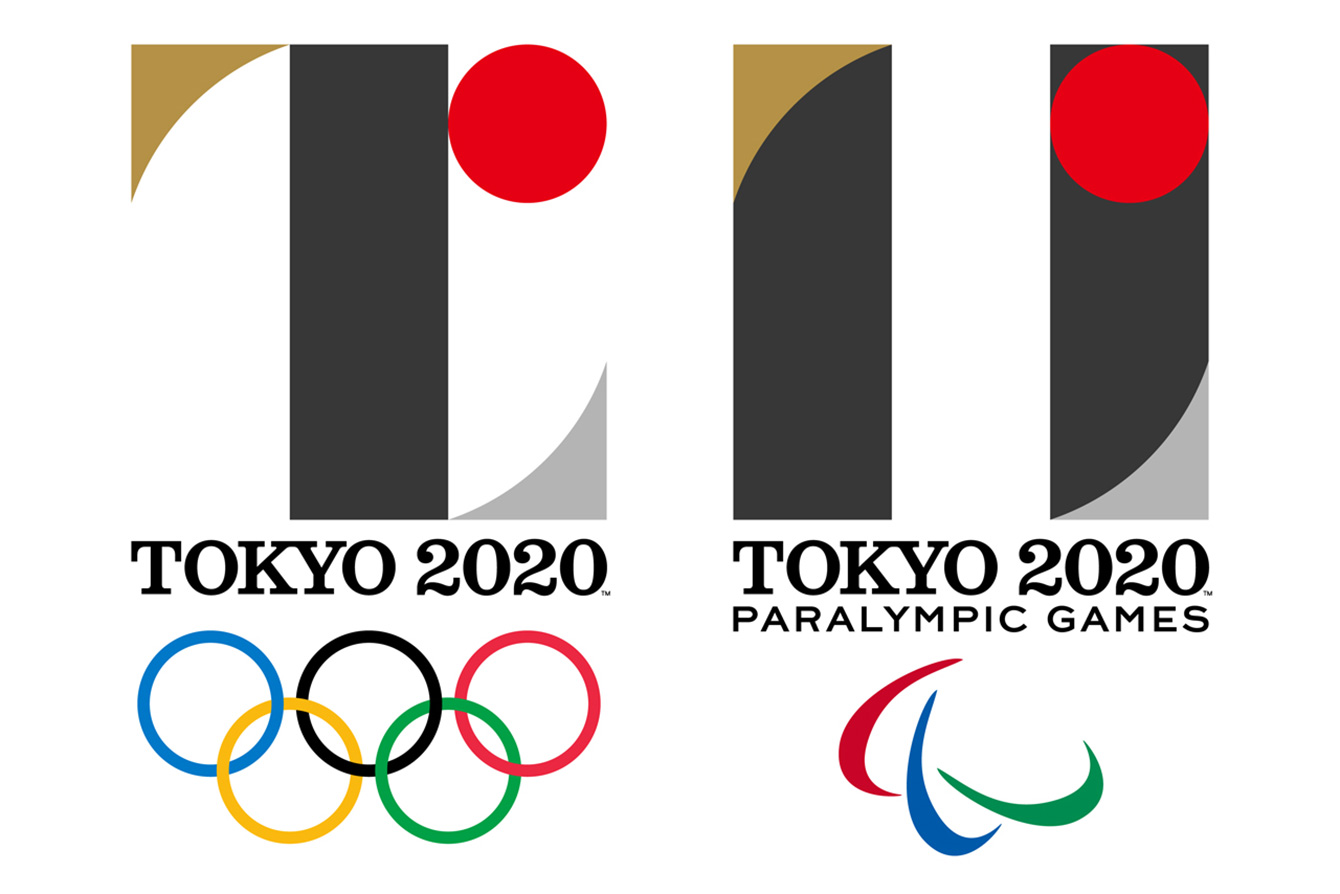
Tokyo 2020’s initial Olympic and Paralympic emblems.
Regardless of the reason for the new design, its checkered pattern has generated mixed reviews. So we took to Instagram to find out what Team Canada fans thought (click “comments” at the bottom of the Instagram post below).

